Audio Waveforms: Visualize Sound Like a Pro
Table of Contents
You've seen them everywhere: the spiky blue shapes in podcast apps, the dancing bars in music players, the jagged line in every audio editor. Waveforms look technical, but they're just sound drawn as a picture — and once you learn to read them, they tell you everything about a recording before you press play. Where's the silence? Is it too loud? Did the guest's mic cut out? The waveform knows.
What Am I Actually Looking At?
A waveform plots amplitude over time. The horizontal axis is time (left to right). The vertical axis is how far the speaker cone (or microphone diaphragm) moves from rest — the loudness at that instant. The center line is silence: zero movement.
What this means in practice:
- Tall spikes: loud moments — a laugh, a door slam, a plosive "p" popping the mic.
- Short, dense fuzz: normal speech or music — constant medium-level variation.
- Flat line: silence (or something very close to it).
- A solid block with no variation: something's wrong — either maximum loudness throughout (clipping) or a DC offset problem.
Waveforms don't show pitch — a bass note and a soprano note at the same volume look identical. For frequency information you need a spectrogram (the colorful heat-map view). Waveform = how loud over time. That's it, and it's enough for most editing decisions.
One thing that confuses beginners: the waveform is symmetric around the center line — sound waves push and pull equally. So editors usually show only the shape's outline. You're reading the envelope (the outer boundary), not individual vibrations, which happen thousands of times per second — far too fast to see.
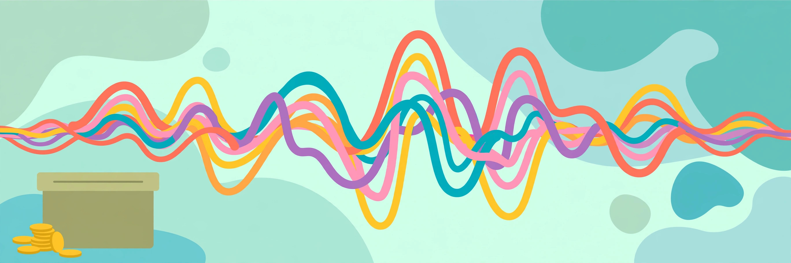
What Do Peaks and Troughs Mean?
The peaks are the story of your recording's dynamics:
- Even, medium peaks with variation: healthy speech. Conversational dynamics — louder on emphasis, softer between thoughts. This is what good raw audio looks like.
- Occasional tall spikes towering over everything: usually plosives, mic bumps, or sudden laughs. In editing, these get tamed (de-essed, de-plopped, or just turned down) so they don't startle listeners.
- Everything pegged at maximum: clipping. The signal exceeded what the recorder could capture, and the tops got chopped off flat. Clipped audio sounds harsh and distorted, and the information in those flattened peaks is gone forever — you can't un-clip a recording. The waveform shows it as flat-topped blocks instead of rounded peaks.
- Tiny, thin waveform: recorded too quietly. It's usable — you can turn it up — but turning it up amplifies the background noise equally. The ideal recording peaks around -12 to -6 dB, leaving headroom for surprises.
Here's the diagnostic trick professionals use: zoom out to see the whole file. A healthy podcast episode shows visible variation — louder intro music, medium speech blocks, quieter pauses. An episode that's one solid brick wall of maximum amplitude has been over-compressed. An episode with long flat sections has dead air to cut. Thirty seconds of looking at the zoomed-out waveform tells you what kind of editing job you're facing.
One more loudness concept worth knowing: LUFS (Loudness Units relative to Full Scale). Streaming platforms and podcast directories normalize everything to a target loudness — typically -16 LUFS for stereo podcasts and -14 LUFS for music. If your episode is much quieter than the target, the platform turns it up (raising your noise floor with it); much louder, and it gets turned down. Mastering to the target before upload means your audio sounds the way you mixed it, everywhere it's heard.
Finding Silence (and Why It Matters)
Silence in a waveform is the flat line — but "flat" has degrees:
- True digital silence: a perfectly flat line at zero. This is what muted sections and generated silence look like.
- Room tone: a very thin, fuzzy line — the barely-audible hiss of the room, the mic's self-noise, the air conditioner three rooms away. Every real recording has this.
- The gap between room tone and silence is where editing lives. When you cut out an "um," you don't want digital silence (it sounds unnatural — listeners hear the absence of room tone as a glitch). You want room tone: the quiet fuzz that matches the surrounding audio.
Practical uses of silence-spotting:
- Trimming dead air: long flat-ish sections between segments are visible instantly. Cut them.
- Finding edit points: the natural pauses (thin flat lines) between sentences are where cuts hide invisibly.
- Detecting dropouts: a sudden flat line in the middle of speech means the recording glitched — a USB mic disconnect, a software hiccup. The waveform shows you exactly where to check.
- Noise gating decisions: if the "silence" between words is thick with fuzz, there's background noise worth cleaning.
Most editors have a "strip silence" or "truncate silence" function that finds below-threshold sections automatically. Learn what your silence looks like first, and you'll set those thresholds correctly instead of guessing.
Waveforms as Art: Podcast Covers and Social Clips
Beyond editing, waveforms have become a visual language. The spiky shape means "audio content" the way a play button means "video." Uses:
- Podcast cover art: a stylized waveform of the actual episode audio as the episode image. It's honest (it's literally the episode), distinctive, and trivially generatable per-episode — some shows automate it.
- Audiograms: the social-media clips with a moving waveform over a static image. They outperform plain link posts dramatically because the motion signals "this is playable content" in a feed of static images.
- Merch and branding: waveform shapes on t-shirts, mugs, and logos for audio brands. A waveform of someone saying the brand name is a genuinely clever logo concept.
- Data visualization: waveforms of speeches, bird calls, or city sounds as art prints — sound made visible as decoration.
The Audio Waveform Image Generator (Canvas PNG Export) renders these directly in your browser — drop in audio, style the bars, export a PNG. No audio ever leaves your machine, which matters for unreleased episodes. Use it for cover art, thumbnails, or just to see what your recording looks like before you edit it.
A design tip for waveform art: color carries the meaning. Single-color waveforms on contrasting backgrounds read cleanest. Gradient waveforms look flashy but can obscure the shape's detail. And leave headroom in the frame — a waveform touching the image edges looks cramped.

Reading a Waveform in 30 Seconds
The quick diagnostic routine, for any audio file:
1. Zoom all the way out. Overall shape: varied and dynamic, or a brick wall, or mostly flat? 2. Check the peaks. Flat tops = clipping (bad). Huge dynamic range with tiny speech = recorded too quietly. 3. Look at the "silence." Thick fuzz = noisy room. Clean thin line = good recording environment. 4. Scan for anomalies. Sudden flat lines (dropouts), single giant spikes (bumps/pops), sections that look different from the rest (a guest on a worse mic). 5. Check stereo (if shown). Two waveforms, one per channel. If they're identical, it's dual-mono — fine. If one is flat, you've lost a channel.
Do this before every edit session. It takes half a minute and it tells you whether you're polishing or rescuing.
Try This Now
Open any audio file you have — a voice memo, a podcast episode, a song — in the Audio Waveform Image Generator (Canvas PNG Export) and look at it zoomed out. Find the loudest moment, the quietest moment, and any clipping. You're now reading waveforms. Apply the 30-second routine to the next recording you make before you edit it, and watch how much faster editing goes.
Try it free — no sign-up
Run the numbers yourself in seconds. Everything happens in your browser.
Open the Audio Waveform Image Generator (Canvas PNG Export)Frequently Asked Questions
What's the difference between a waveform and a spectrogram?
A waveform shows amplitude (loudness) over time — one dimension of the sound. A spectrogram shows frequency content over time — which pitches are present at each moment, displayed as a heat map. Waveforms answer "how loud when"; spectrograms answer "what tones when." Editors use waveforms for cutting and leveling; they use spectrograms for noise removal and forensic work.
Why does my waveform look like a solid block?
Either the audio is heavily compressed/limited (common in modern music mastering — the "loudness war" look) or it was recorded too hot and clipped. Zoom in: rounded peaks mean compression; flat-topped peaks mean clipping. Compression is a choice; clipping is damage.
Can you tell if audio is "good quality" from the waveform?
Partially. The waveform reveals clipping, dropouts, noise floors, and dynamic range — all real quality factors. It can't show you compression artifacts, subtle distortion, or frequency balance problems. Ears are still the final judge; the waveform is the fast first pass.
What causes the waveform to be off-center (not symmetric)?
That's DC offset — a constant voltage bias pushing the whole signal up or down. It's usually inaudible but it eats headroom and can cause clicks at edit points. Most editors have a "remove DC offset" function; run it as part of your cleanup routine.
Why do some waveforms show two mirrored shapes?
That's a stereo file: top half is the left channel, bottom half the right (or vice versa). If both halves look identical, the audio is dual-mono — two copies of the same signal. True stereo shows differences between channels. A podcast with one flat channel and one active channel was recorded in stereo with only one mic connected — convert it to mono.